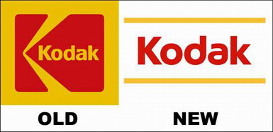
Kodak’s New Logo

“In another break with the past, Eastman Kodak Co. is introducing a new corporate logo designed to help the company forge a new image as a cutting-edge, 21st century innovator.”
Is it just me, or did some board member’s nephew’s design startup just laugh all the way to the bank? I didn’t think it was possible to make a lower case “a” look both retarded and “cutting-edge” at the same time. If that’s the direction lower case vowels are heading, cOUnt mE OUt, fOOls!
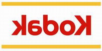
It almost goes without saying that the new logo looks much better backwards (this is J’s first axiom of 2006 – ALL SUCKY, REDESIGNED LOGOS LOOK BETTER BACKWARDS).

Kabok, bitch!


One Comment
Debiddo
Your new venture company and slogan will be:
J’s Backward Printing Co. – I do the work so you can look cooool.