
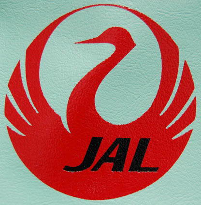
The red circle is the sun goddess Amaterasu. It is the rising sun on the Japanese flag. It is Zen. It is an amazupai umeboshi. It is beautiful in its simplicity. Sadly, it is no longer used by Japan Airlines.
Back when airplane food truly sucked, when they still handed out packs of honey-roasted peanuts along with mini-decks of playing cards, and when I used to be able to sneak into first class with my sisters, JAL had the best logo of all of the airlines. Riding a plane with the tsuru mark made even the flight over to Japan seem exotic. It was a graceful metaphor for the Boeing which was carrying us to an exciting foreign land.
As I remember, JAL had some of the most beautiful and nice stewardesses that I can remember. They often turned a blind eye to us when we snuck up to the first class seats. Only once, when a grumpy old man protested to the stewardess were we (nicely) turned back to our seats.
Who made the decision to get rid of the tsuru, a symbol that conjures nostalgic images of Japan for a corporate logo? If I were the president of JAL, that dude would be so fired.

|
You are using an insecure version of your web browser. Please update your browser!
Using an outdated browser makes your computer unsafe. For a safer, faster, more enjoyable user experience, please update your browser today or try a newer browser.
|
5 Responses to Memories of JAL